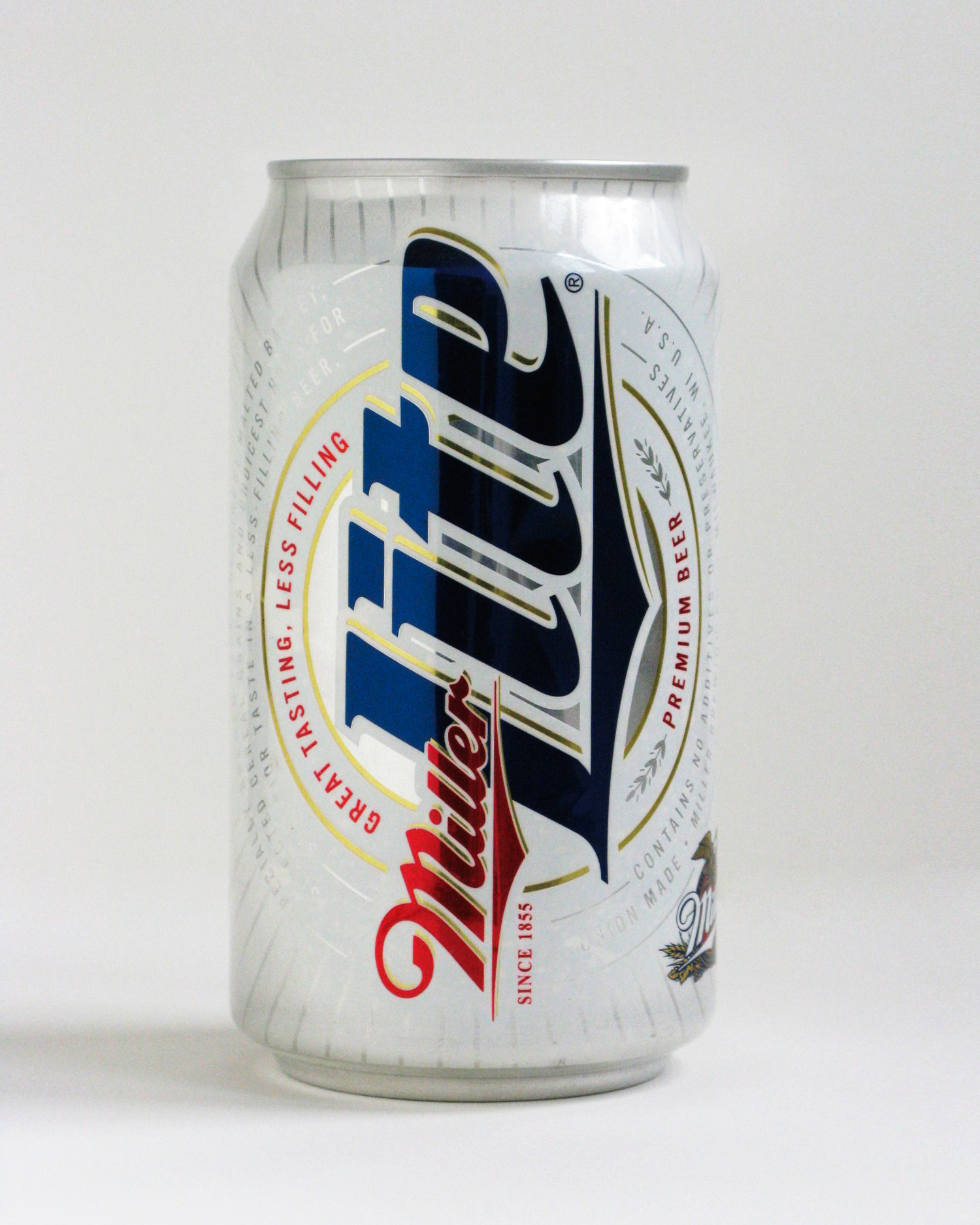
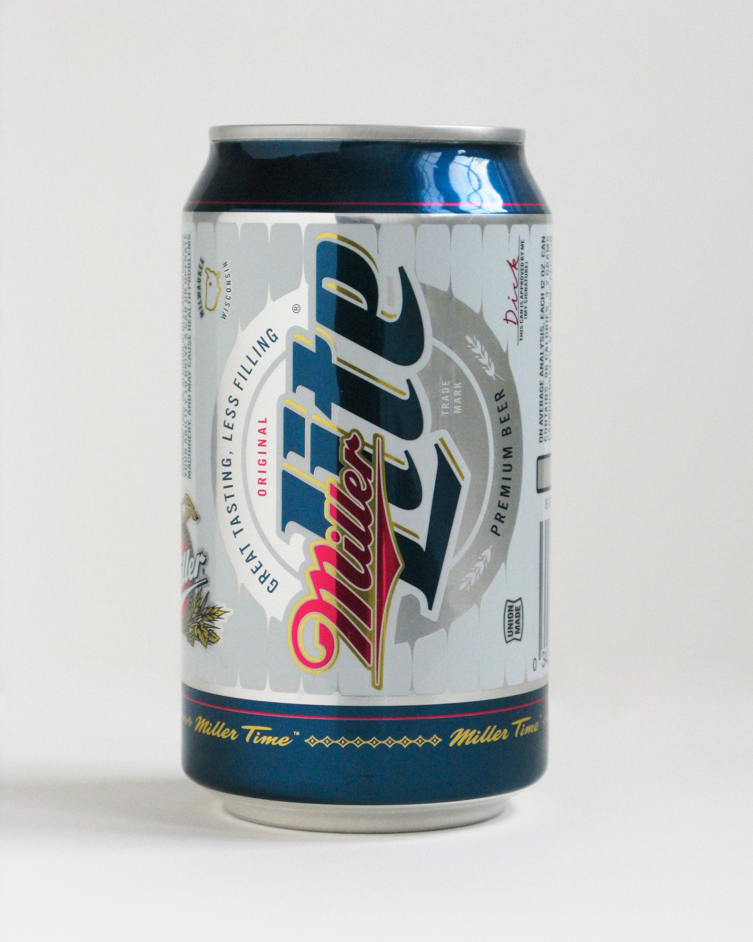
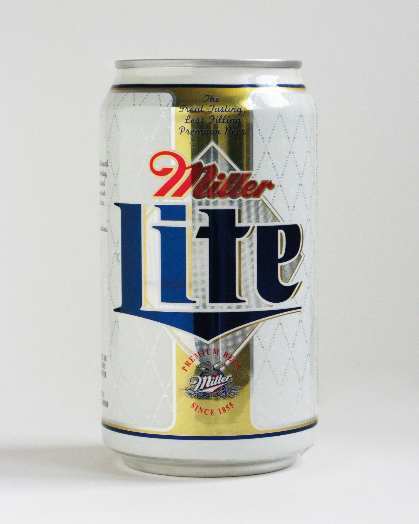
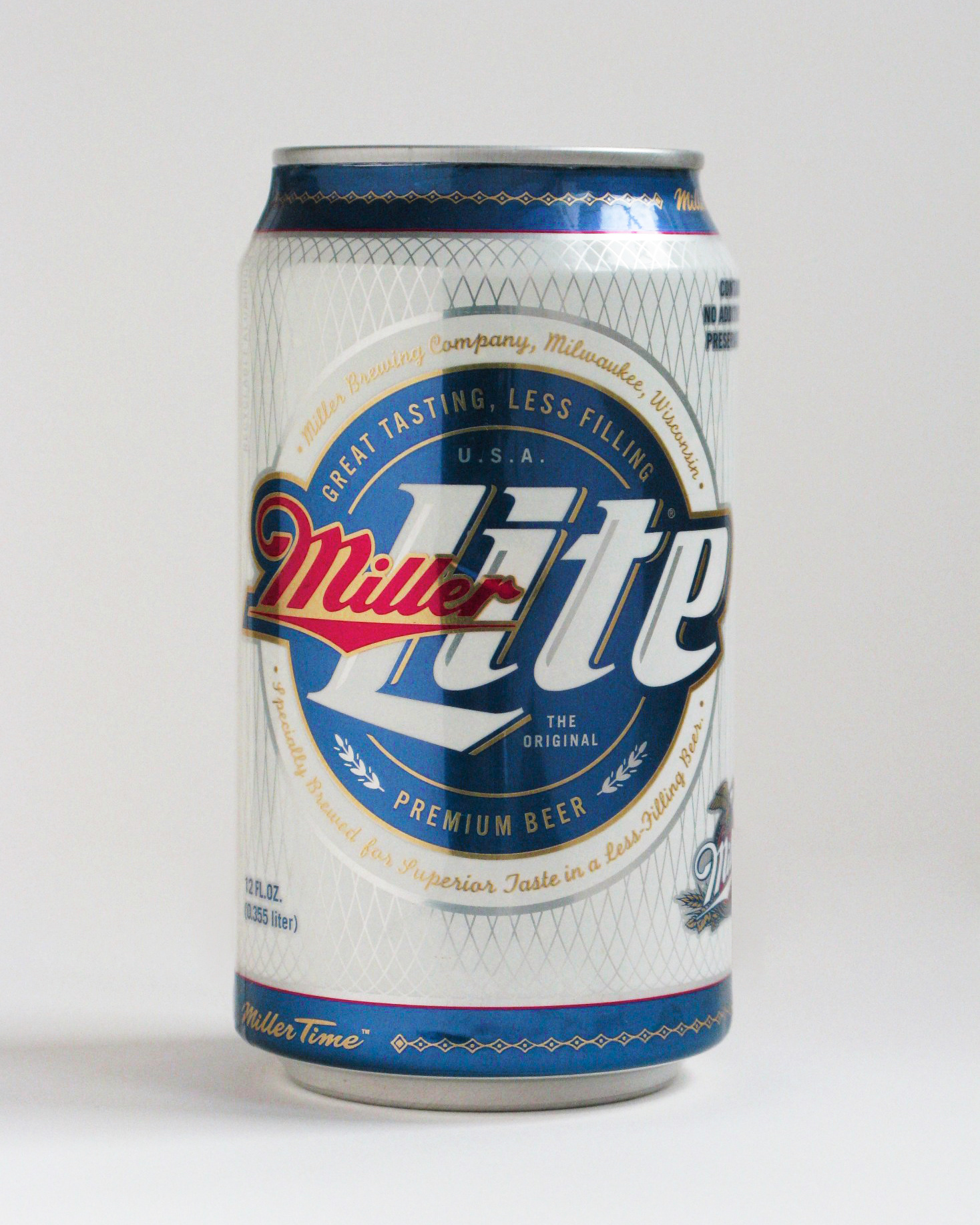
Miller was looking for a new package that would enhance one of the world’s most well-known beers, Miller Lite, while helping it feel a little less like my “girlfriend’s beer.”
Numerous explorations were created and put in front of consumers to learn what design elements would shift perceptions: The size, direction and angle of the logo, the use of colors in different amounts, the use of iconography from the past. The heritage of Miller brewing, and of course, “Miller Time,” the honored moment of declaring it’s time for a little celebration.
The scale of the logo and the amount of white had the biggest impact on preference. Increasing amounts of silver while reducing the amount of white helped reduce the “girlfriend” factor. A more script-like logo helped connect the brand to sports, such as baseball, and the vertical version of the logo linked it to the past.
Ultimately, these explorations led to more design directions eventually resulting in a new, more manly Miller Lite beer package.